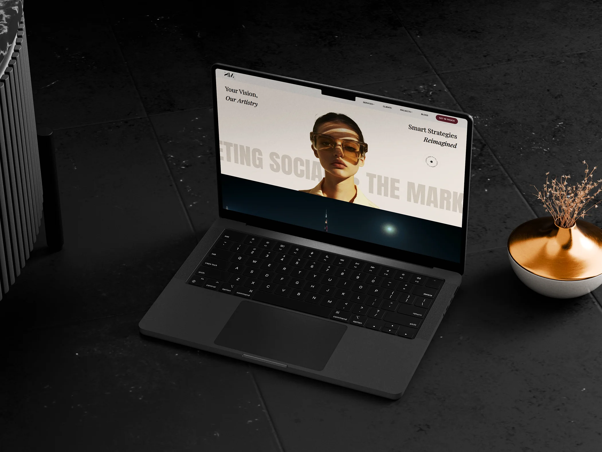
THE MARKETING SOCIALS
- About Project
Vama Inverters stands for smart, reliable solar energy — built for the future, made for today. When we were brought in to develop the branding, our aim was to give Vama a strong, confident identity that reflects both innovation and trust.
We started by exploring the core idea of energy — how it flows, how it connects. The logo was designed with bold, geometric shapes that suggest movement and precision. The sharp angles, clean symmetry, and deep blue tone were all chosen to convey clarity, strength, and modernity.
From there, we built a complete visual language — choosing fonts, colors, and layouts that keep the brand simple, professional, and impactful. Every element was carefully crafted to feel both technical and approachable, just like the product itself.
This branding gives Vama a clear voice in the solar space — strong, focused, and ready to lead.
- Client: Goldisolar
- Category: Branding, Logo
- Role: Art Direction, Design